– Quincy news and review from Quincy Quarry News
Quincy’s Old City Hall remodeling redo review finally hits the fan.
After some weeks of haggling, Quincy Quarry was fortunate to have a small fortune available to engage the services of internationally known architect I. M. Wright to review the Koch Maladministration’s redo of Quincy’s old City Hall.
Then, as per the usual by most architects, Wright then ran late and so missed his original Quincy Quarry publication deadline.
Wright’s excuse: as the City Hall remodeling project ran even later behind schedule as well as cost roughly twice its original maximum cost as promised by the Koch Maladministration. While true, these delays are mutually exclusive.
Regardless, Wright’s review follows.
I. M. Wright: to those expecting a damning review, please note that I was pleasantly surprised with the outcome of the city’s remodeling of Quincy’s 172 year old and now once again called Town Hall.
Then again, my expectations were low given that other recent major municipal construction and proposed redevelopment projects have so lowered the bar.
At the same time, please note that my assessment is predicted on viewing the project as but a remodeling as opposed to either a renovation or restoration as it was neither of the later two. Not even close to either as a matter of fact.
While cost per square foot (roughly $1,000.00 spent per square foot if the basement space is included) should have proven more than ample funding for a Colonial Williamsburg historically accurate restoration, the final output was fraught with shortcomings when compared to such an appropriate point of comparison.
In particular, all manner of liberties widely taken inside of the building and thus resulting in but a tacit homage to the original Greek Revival design of this historic building.
As such, think of the interior remodeling output as instead comparable to – for example – the best large events room for the better Marriott resort hotel near Colonial Williamsburg than a historic restoration.
That or a DisneyWorld movie set grade replica.
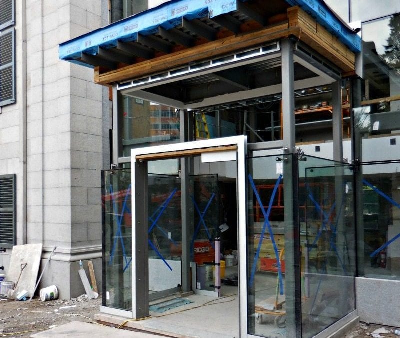
Overall, while the general design was sound, the various modern amenities upgrades decently integrated and the new glass and stone annex pleasant enough, the overall design plan was still on the order of work designed by a third year architecture student.
In short, solid enough while at the same time also stolid as well as on more than a few occasions clichéd for no apparent good reason.
At the same time, the workmanship of work crews must be acknowledged as for the most part competently executed.
At the same time, it was clear that the project has been less than successfully rushed along to completion.
For example, it was still far completed when it officially dedicated last month. It was also obvious that this project was all but assuredly often revised along the way so as to less than successfully moderate the final cost of a project that has – so far already – ran almost twice its original promised maximum cost.
Then again, only running twice more than the original budget figure would be an unprecedented accomplishment by my brother Frank.
That and only time will tell if old City Hall’s redone slate roof leaks and as was the case with the also recently as well as also expensively redone slate roof at nearby Coddington Hall.
In the meanwhile, examples of interior design work shortcoming include that a fair amount of space in an already but modest-sized building has been wasted as well as thus also expensively so.
In particular, a considerable amount of space is wasted in the front of building as the remodeling plan opted to implement four modest rooms in the corners of the building on its first and second floor. Not only do these rooms fail to convey any obvious historicity, they also exhibit little in the way of obvious planned as well as thoughtful and/or significant usages.
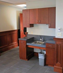
Rather, three of the rooms appear to instead be slated for perhaps at best haphazard use as antechambers and the fourth has been put to use as a ground floor kitchen space that can clearly as well as inexplicably be readily seen from the sidewalk by passersby.
In addition to the use of Ikea grade kitchen cabinets and mid-grade modern plumbing fixtures, this kitchen is further incongruous as even a first year male architecture student who does not know how to cook knows that a kitchen should face the backyard unless the remodeling design project is for – say – a trendy open kitchen North End trattoria or a Korean barbecue.
The design ethos for one of the two other as well as large rooms on the first floor of the building, however, is utterly transparent.
The original promised restoration plan touted that– among other things that have also not transpired – the City Clerk’s office would be returned to its former venue on the first floor of old City Hall. Also missing is the promised historical recreation of office space long rented by John Quincy Adams after his stint as President of the United States.
Instead, considerable space has instead been dedicated to a simple display room full of of historical tchotchkes whereas the City Clerk’s office has instead been relocated to the second floor of the modern City Hall Bauhaus glass house annex.
As for the transparency of this design change, the rationale behind this change is clearly transparent as the project’s lead architect is a long time member of the Quincy Hysterical Society.
That how the lead architect is also the mayor’s long rumored to be pro bono at least co-speechwriter for certain of his history-laden as well as generally less than completely boring mayoral speeches.
After all, given that the Hysterical Society is widely expected to at least facing a massive rent increase after the Supreme Judicial Court most likely voids its 50 year lease’s current fixed monthly rental rate of $100 for the Adams Academy building a couple of blocks down Hancock Street, this apparent moving of apparently at least some of the Hysterical Society’s historical odds and ends into a new venue without any apparent rental charge makes perfect sense – except, that is, for local taxpayers who will continue to have to foot the costs of this apparent latest sweetheart deal both made by as well as for mostly City Father insiders.
Next up to address in this review is the new City Council meeting room chamber on the second floor.
The new chamber room is totally new given a gut wall removal of both the old interior and what had been installed before the September 2014 City Hall fire.
For the most part, the remodeling returns the space back to roughly its original size and configuration when it was first used as the town meeting hall when Quincy was still but a small town.
For example, a new balcony was created in the space where there originally was a balcony.
Unfortunately, there are problems with the new balcony, along with other problems.
The problems with the balcony include that it does not exactly appear to be an accurate replica of the original balcony. For example, the balcony’s design and especially its varnished woodwork tends to be generally generic as opposed to actually historic in form.
Further, there are spots in the new balcony where its floor sways and squeaks. While such are to be expected in a restored original old balcony, such less than rigid wholly new construction can only cause pause, especially for anyone who suffers from acrophobia.
Other shortcomings include variability in the woods used in the flooring of the new balcony.
Specifically, pre-finished wood floor planking of one species is used for most of the wood flooring whereas inexplicably other then for cost reasons an entirely different species is used for stair step end pieces and other flooring trim.
In turn, this amalgam clearly exhibits different – if not also disharmonious – wood grains and wood colors.
Further disharmonious is how the wood surfaces installed on the first floor exhibits middling – at best – varnishing of this wood and thus only makes more obvious the variability of wood species used in the flooring throughout the building.
As such, whoever all approved all of the likely various change orders – as well as what would clearly appear to be innumerable other sorts of changes – should be pilloried in colonial style stocks in front of City Hall for the rest of this winter.
Returning to an addressing of the main room itself, again, the remodeling of this space is a decent functional makeover of the space to incorporate such modern amenities such as electric lighting and air conditioning that were likely not even but merely imagined when the building was built in 1844 .
Again, however, the historicity of this room was slighted as the remodeling of it is more of a general homage to the original design as opposed an attempt to effect even but merely a modestly accurate historic restoration.
Divergences from the original designs include that the stained and then varnished new woodwork in and around the City Council’s dais, the new wainscoting throughout the room and other wood trim work.
These wholly new woodwork trim designs are far more akin in design and middling detail to those typically seen in a new courtroom or a better and more recently built steakhouse than to what one would expect to find in a nearly two hundred year old and carefully handcrafted by craftsmen town meeting hall.
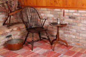
That and it is also impossible to assume that the original tables at the head of the original meeting room were anything other than relatively straightforward large tables with Windsor style or other period appropriate chairs.
That and a likely simple podium somewhere or other.
Instead, however, the new furnishings include a massive semi-circular arc of interconnected desk spaces complete with microphones and overstuffed executive desk chairs more akin with what is to be today found in the Presidium than anywhere in New England in 1844.
The overall interior color and design scheme is further a less than historically accurate jumble.
For example, while the plaster walls were painted in a tolerably close to historical shade of cream of pea soup green, the floor of the meeting hall were carpeted whereas the original hall surely featured at least primarily wood flooring.
Further, not only was the carpeting of only but a middling hotel grade of synthetic carpeting – and thus many grades below the custom woven imported as well as extravagant wool carpeting installed in the mayor’s expansive office suite, the primary cranberry red color of the carpet is all but completely at odds with the rest of the color palette of the rest of the hall.
At best, the carpet features small snippets of colors somewhat similar to those used on the walls, ceiling and windows. At the same time, one has bend down and look closely to spot these snippets.
The end result is an attention grabbing discordant cacophony of color as opposed to those appropriately formal and congruent.
In other words, problems that one can only hope will be corrected when the room is due for repainting and new carpeting at some point in the distant future.
Local taxpayers can thus, in turn, only hope that any such significant renovation work will not be needed until such time as the bond debt on this currently projected to cost $12.7 million project is paid off in full in or around 2045.
In the meanwhile, as well as again, it is only proper to note that the still as yet uncompleted remodeling of old City Hall is a perfectly serviceable remodeling of an old building even if it is neither all that historically correct nor even remotely conveying value commensurate with its remodeling cost of $1,000.00 per square foot.


Wright was kind. This remodeling was a wicked expensive hack job inflicted upon a grand old building.
Hank is spot on. Not even the Bauhaus glass house annex has any pizzazz.
Wright, Richardson and van der Rogue all make sound points about this hackneyed and primarily an inauthentic interior remodeling project of a historic treasure.
In particular, Wright is right: not only is the interior color palette historically inaccurate, it is hard to image one more disharmonious for a mid-19th century Greek Revival style town hall AS WELL AS 21st century eyeballs.
Equally convoluted is the varying use of wood species in the flooring, including mixing of species within the same area of flooring. Was this project forced to such extreme value engineering as it cost spirally out of control that the contractor was reduced to buying closeout lots of pre-finished flooring at Lumber Liquidators or what?
Also troubling is the wainscoting and other wood casework. Granted, the use of historically accurate and old growth species of lumber would be cost prohibitive; even so, the casework is still unacceptably fraught with gouges and defective pieces of wood that should have never been used. Similarly, much of the woodwork is already showing excessive signs of finish degrading courtesy of wood expansion and contraction.
Granted, while master craft work is hard to secure these days, the cost of this project should have resulted in a reasonable facsimile of master quality whereas the final product did not come not even but merely remotely close.
In short, whoever is in charge of the punch list on this project should be punched, if not pummeled.