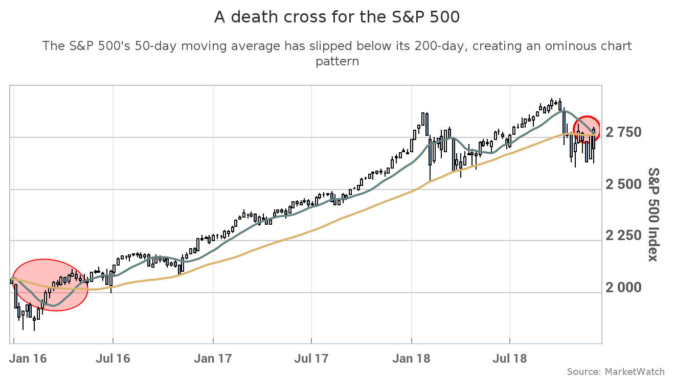
Technical graph stuff
Graphic care of MarketWatch.com– News covered by Quincy Quarry News with commentary added.
A death cross for the S&P 500 index highlights a stock market in tatters.
The S&P 500 index joins the ranks of market benchmarks forming a dreaded Wall Street chart pattern: the Death Cross.
A death cross has materialized in the S&P 500 (see SPX, -0.15%0) stock index when its 50-day moving average price fell below its 200-day moving average price.
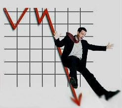
Taking a nap or roadkill?
A Stevan Noronha imageTechnical stock analysts view such an event as a sign of at a least a cooling of the market.
In simple terms, what goes up eventually comes down at least a bit for awhile.
Whether or not things turn out to be a pause that refreshes or a clarion call for an economic downturn remains to be seen.
In the meanwhile, what is clear is that a number of companies have come short on their expected earning of late and their stock prices have thus suffered accordingly.
What goes up eventually comes down …
A barrons.com imagePlus, even if we are just be looking at a brief timeout, problems can still arise.
For example, for those who have planned on things continuing to go up and so acted accordingly.
Conversely, those who are duly prudent might be too prudent and so further cool the economy by saving instead of investing.
In short, time will tell. After all, it always does.


Source: A death cross for the S&P 500 highlights a stock market in tatters


QuincyQuarry.com
Quincy News, news about Quincy, MA - Breaking News - Opinion
No more posts